Log
Short notes, now and then: what I’m building right now and what I learn along the way. A selection, not a record.
New entries are also available as a feed.
October 2026
Stöberby now has its own page: an island in the fog that clears as you scroll. You can sign up there for the app’s test round. Join the test round
The relaunch is live: six designs drawn from the same content, switched with the button in the bottom right, and not a single script in the browser.
September 2026
With the app still unbuilt, a year ran through on fast-forward, and after six months the map stood still. Now every island is a chapter, and a boat takes you on to the next one.
Every island grows from a single number: coastlines, rivers and regions differ for everyone, and the same number always gives the same island. So only what has happened gets stored.
Started something new: an app that pins side quests for real life to a board, from a few minutes to weeks. Whatever you finish shows up on a hand-drawn island.
Our restaurant list can now be shared: as a table, a top list, a poster or a year-in-review story. Everything is drawn right in the browser, and private notes stay out.
Shared images used to crop photos into thin strips. Now the photo sets the shape, and the layout closes in around it.
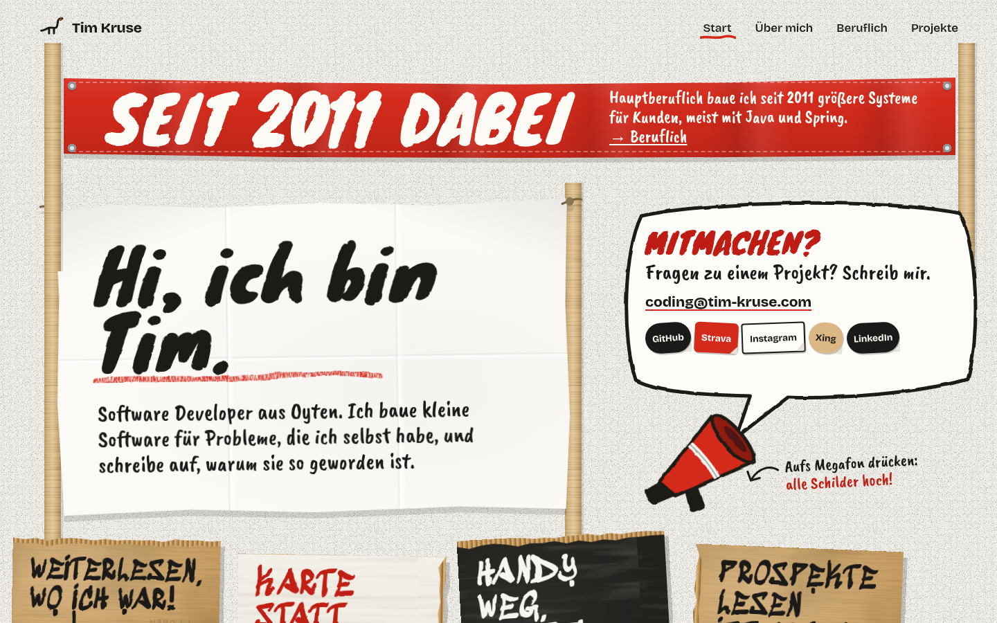
Designed a new look for the relaunch: a rally of hand-painted cardboard signs, each project one sentence in brush lettering. It replaces an older design.
Photos can now be uploaded at the table while the ratings are still hidden. The scores are secret, the evening isn’t.
With “remove finished volumes” on, a volume still stayed on the device if it was finished on another one. Now it goes away in that case too.
Pairing the brick is now followed by a test tap. That way Android asks its NFC question during setup, not in the middle of the first real focus session.
Since Android 13, the system blocks accessibility services of apps installed from a file and only says “access denied”. The setup wizard now walks through unlocking it in a step of its own.
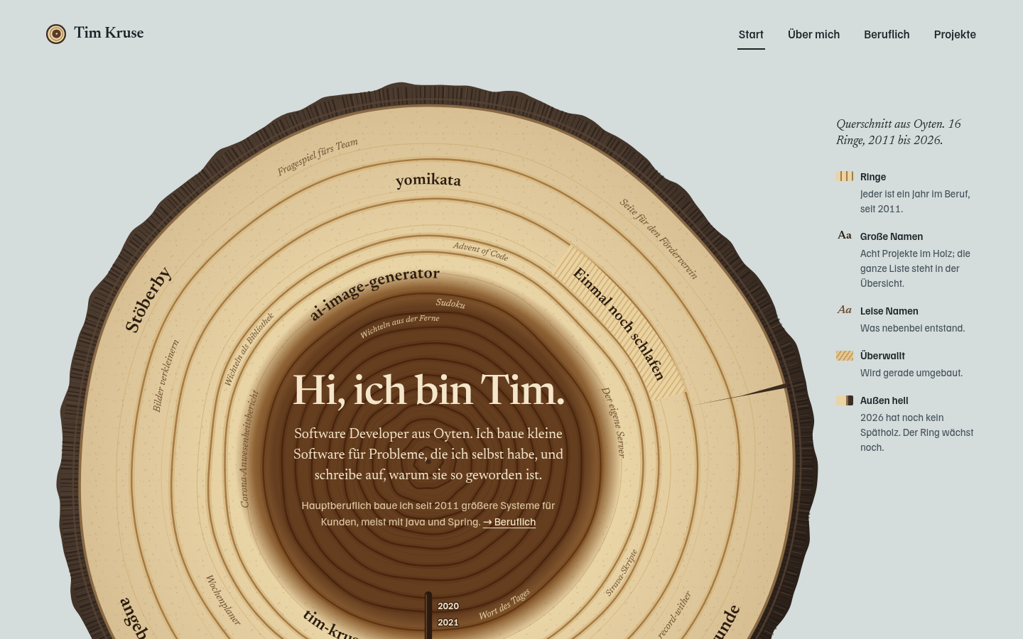
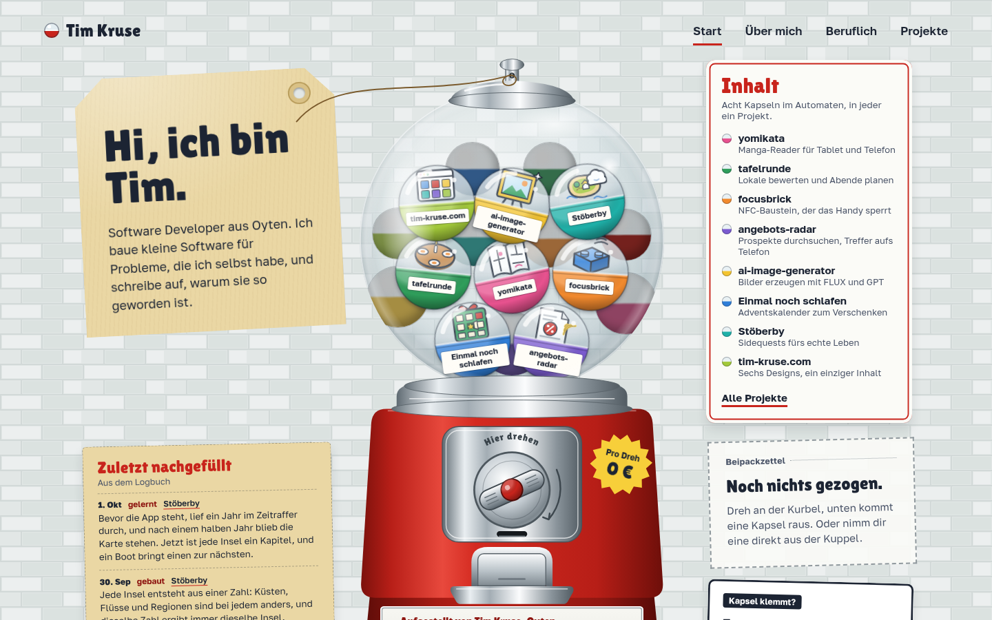
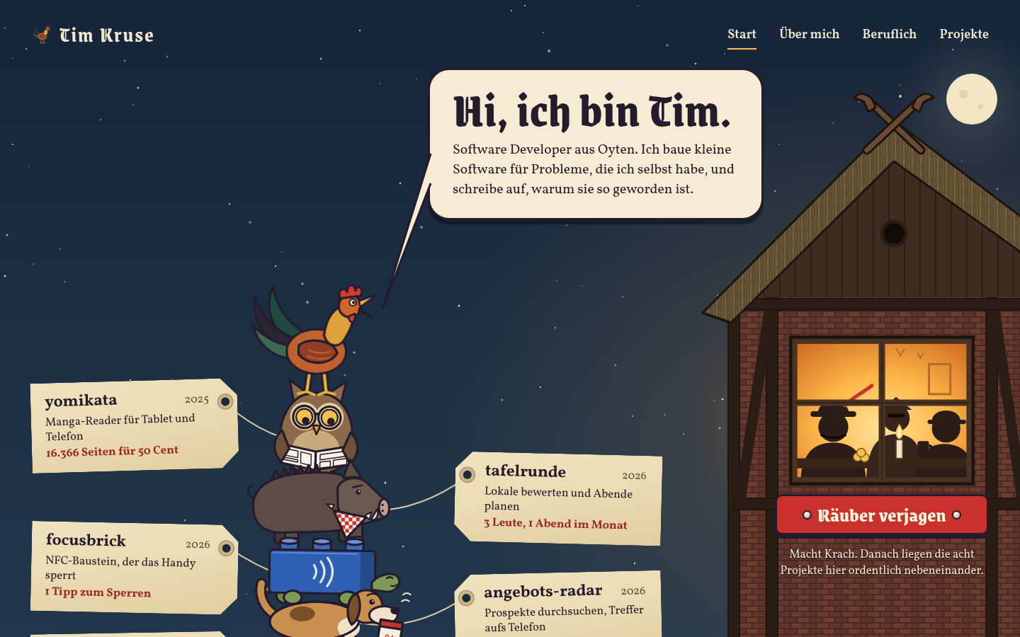
Three new designs for the relaunch: tree rings with one ring per year, the Town Musicians of Bremen as a wobbly tower of project animals, and a capsule machine with one capsule per project.
The homepage now opens with “Hi, I’m Tim.” – after several rounds of making the headline shorter and shorter.
The app now tells me when a new version is out and downloads it on request. On a fresh install, a wizard walks through setup in eight steps.
New “Brick” look: light while idle, dark as soon as a focus session is running. The widgets and the quick settings tile follow along.
The widget often sat on “Loading…” – nothing was loading, it had simply never been sent anything. Now the app always pushes the latest state first, and the covers follow.
New look for app and web: how far along I am in a series now shows as little book spines on a shelf instead of numbers.
Texts and project data now live in files that can be edited locally in a small content editor instead of in the code.
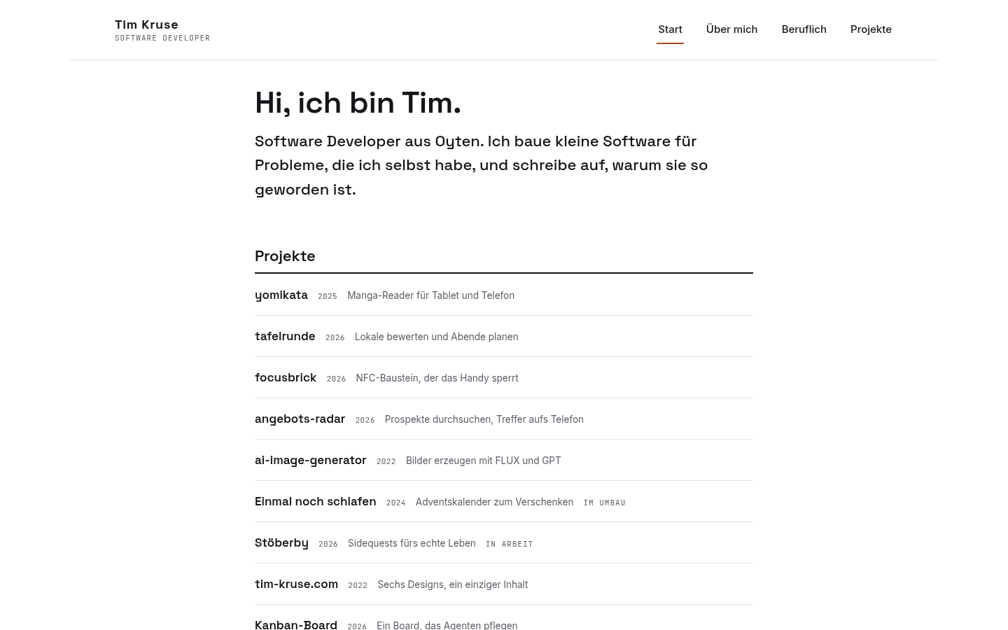
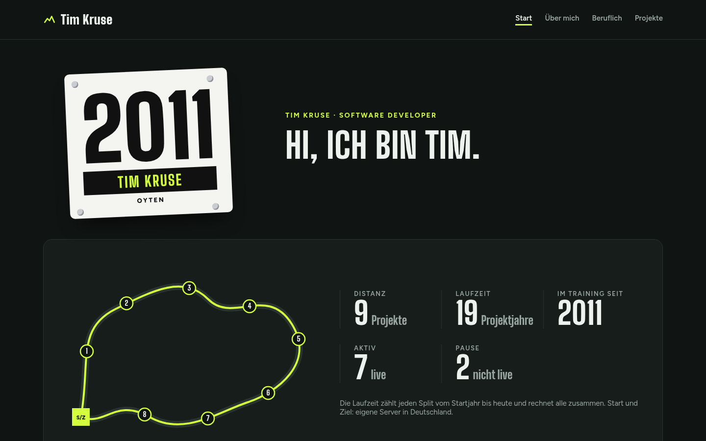
For the relaunch, the site gets several complete designs instead of just colour themes. A button at the bottom switches, each design has its own URLs, and the plain address always shows the default.
New brand “The Forest”: fir green, paper and candle yellow, from the landing page through the portal to the emails.
A button now opens the volume straight in Bookie, the app I use to track my reading. I still set the status there by hand.
In panel mode, zoom and dimming were off on some volumes. The app was mixing two scales: the one the page was measured in and the one of the smaller image it actually loaded.
The panel studio got a second page: pick the number of GPUs, one click, and renting, setup, measuring and teardown run on their own.
The largest measuring run so far: 16,366 pages on two rented graphics cards, 14 minutes of computing, about fifty cents. The panels are found by Magi, an image model made for manga. Magi on GitHub
Test day: went through the whole flow like a customer, from the first click to an opened door. 24 findings fixed; the cart now survives a cancelled checkout, for example.
The countdown on the landing page showed one night more than the calendar itself. Daylight saving time tripped up the rounding; it now counts across UTC midnight.
The headlines looked stretched. Nothing was broken – the font’s heaviest weight is simply 65% wider than usual. Now a single typeface carries the whole site.
Anyone who wants their calendar content gets it on request as a ZIP: all texts and the photos at full size.
Once a volume is half read, the next one in the series is already waiting on the home screen. A series no longer drops out of sight just because a volume ended.
Every series now has a header with the essentials: how much is read, what’s started, reading direction and description. Expanded, it shows long titles in full.
Keeping the next volumes ready offline first ran for every series; it was meant only for the one I’m currently reading. Switched to a per-series toggle the same evening.
On a rented GPU, panel detection took about 0.3 seconds per page back then, so transferring the pages to the card suddenly made up a third of the time. Now the next volume is already on its way while the card is still computing.
Wrote the terms, cancellation policy, privacy policy and legal notice, plus a checkout with a withdrawal function. Fonts are now served by the site itself instead of by Google.
New in the reader: a double tap jumps from panel to panel, in the app and on the web. A detection model measured the panels on every page beforehand.
Rotating the phone could make the web reader jump back seventeen pages. The page was worked out from the scroll position, which no longer matched the new width after rotating.
August 2026
At a restaurant visit, everyone now rates in secret; the scores are revealed once, for everyone at the same time. Until then, nobody sees the others’ numbers.
After the first test run it was clear: too dark for the audience. The landing page and portal now default to light, with dark behind a toggle.
The widget suddenly showed “Home” above a book cover. Three attempts later, the data turned out fine; the home screen was mixing up two card layouts. Now there is only one.
The web app’s home page is now configurable: hide and reorder rows, covers in three sizes. “Show all” now jumps to the right section instead of just anywhere.
A kanban board of my own, shared by people and AI agents: agents ask questions on a card, and the next run reads the answer. Two rules live in the code, not in a guide: cards that are too terse get rejected, and only a human can sign off.
Two images with the same seed differed by 0.2% in a test: identical to the eye, but not reproducible. So the seed field is gone from the interface instead of promising something it can’t keep.
Putting the app in the background while an image was being generated ended in “Failed to fetch”, even though the server finished the image. Now the app picks up the result as soon as it is visible again.
The image generator speaks current models again: GPT Image 2 and FLUX.2 instead of the retired DALL-E, plus up to four reference images. Along the way I measured which models actually respect the aspect ratio and which just quietly accept it.
OCR reads leaflet pages well but too often pairs prices with the wrong product. It works better when an image model gets the page plus numbered text lines and may only answer with numbers: that way it can’t invent a digit.
New: a shopping list that keeps its own copy of a deal’s details. When the deal expires it says “was 1.99” instead of vanishing while you’re standing in the store.
Deals now show pack size and unit price. A six-pack of oat drink for €10 looked expensive, but at €1.67 per litre it beats the single litre at €1.79.
Searching for “becks” didn’t find “Beck’s” because the apostrophe broke every comparison, so a watch for it would never have fired. Special characters are now dropped on both sides, which also helps Ben & Jerry’s and M&M’s.
Started a radar for supermarket deals: you note what you’re waiting for, a nightly run reads the leaflets, and a match sends a notification. Notifications come bundled, so a new week of deals doesn’t turn into an avalanche.